Looking for even sleeker experience? Check out my mod, OneBar!
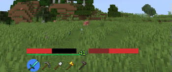
A resource pack that makes your HUD look plain and compact, inspired by Google's (Android) Material Design elements and colors. It is compatible with any other resource packs, as it only changes the menu, hotbar and HUD items.
The colors and elements are chosen to be minimalistic and contextual, therefore it is not just a reskin of the default elements. For example, the hunger bar is the same color as health by default, in order to keep it from drawing attention until you actually get hungry. Similarly, the horse jump bar is dynamically colored and resized to fit under it's health bar. For inspiration, I used the progress indicators subsection of material.io.
Mod support:
- AppleSkin (HUD indicators hidden, tooltip changed)
- Mod Menu (buttons)
- No Chat Reports (buttons)
- ViaFabric (buttons, signal icons)
Credit: icons used with permission from Google and Material Design Icons contributors.
Psst! Want to make your inventories pretty too? Check out this beautiful resource pack! (not mine)

